An In-tents AR Experience
MEC - Mountain Equipment Company
Overview
Back at Finger Food Advanced Technology Group, MEC approached our team to produce a photogrammetry asset ingestion pipeline and design an extended reality application to showcase camping tents. Their rationale was simple: retail space is always at a premium, and camping tents take the most space on the store floor.
"The best-selling tents are the ones that customers see on the store floor", MEC told us.
Role:
Creative Director, Product Designer. Led 2 other Product Designers.
Creative Director, Product Designer. Led 2 other Product Designers.
The Challenge
MEC faced a problem that many retailers like Amazon and Walmart have: customers were returning their products because expectations didn't meet up with reality. MEC customers were returning their tents after realizing they were either too large or too small for their use case.
We were tasked to build both a Microsoft HoloLens application and a mobile AR experience on the iPad: two completely different platforms. The former being a wearable, mixed reality headset, and the latter of course, being a mobile device. Interaction paradigms, fields of view, visual fidelity, and presentation of information were all quite different.
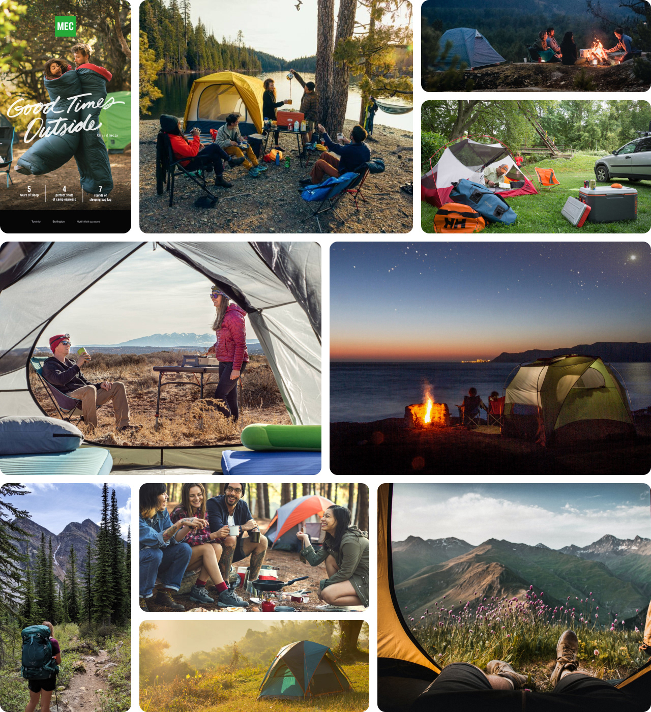
We had a few product design principles to live by as we built the application: the experience had to evoke the emotion of MEC and its outdoor brand, the photogrammetry-scanned products had to be photorealistic, and the experience overall must help and inform purchasing decisions.
Process
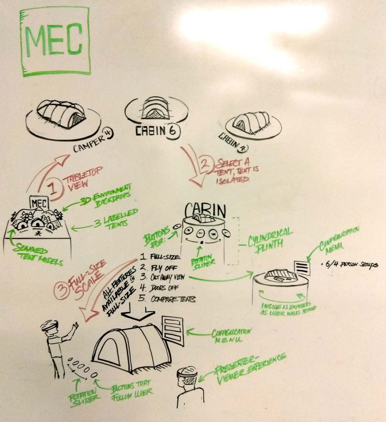
Mixed reality experiences are often difficult to explain on Figma when there is literally an extra dimension to explain and detail. For my design process, whiteboards and moodboards are quick and easy ways to spatially communicate ideas, gain alignment on the emotion we want to evoke, and also foster collaboration with clients when running a workshop. Whiteboards are also forgiving, giving you the freedom to quickly scrap ideas that sounded much, much better in your head.
Deliverables
Referencing MEC's brand identity guidelines, we strived to create a flawless MEC experience in Sketch (later in Figma). We created a design system that referenced their iconic green, and utilized their heavy, condensed typefaces so their brand was retained and prevalent.
The 3D portion of the experience included a miniature campsite (and campfire!) to introduce people to the best-selling MEC tents, and subtle but playful transition animations when switching between products and configurations.
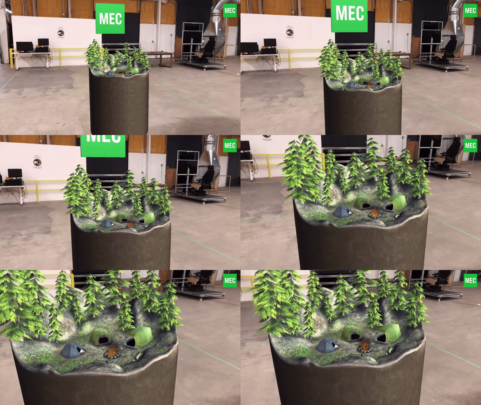
Intro to the experience
Configure your tent to fit sleeping bags, backpacks, and water bottles.
Outcome
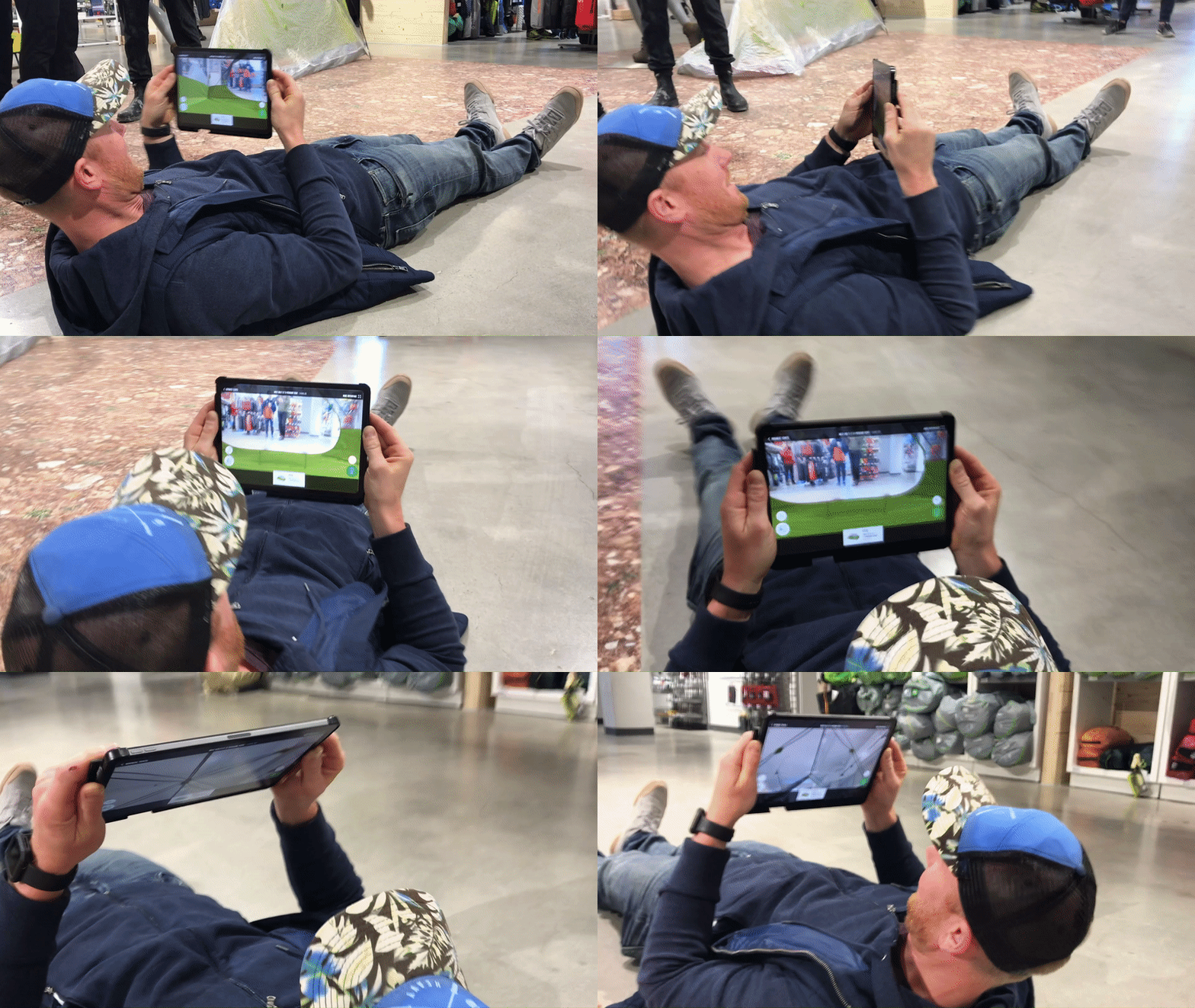
I was involved in two separate showcase opportunities: a HoloLens presentation for internal MEC headquarter staff, and an iPad experience in Toronto at their newly-opened flagship store.
Not only did users and customers find the applications helpful in informing their purchasing decision, but it also highlighted the power of immersive, 3D experiences: people were lying on their backs to simulate their sleeping positions, crouching down to measure headroom, and stepping over the entranceway to 'avoid' stepping into the tent body.
___
“We believe the future of the customer experience will be significantly changed through the integration of technology. This project with Finger Food demonstrates that belief."
David Labistour, Former CEO, MEC
David Labistour, Former CEO, MEC
“Searching through a few tents that MEC sells. Nice zoom and explore the inside and outside of a tent. Love augmented reality!"
Apple App Store
Apple App Store
Want to chat about this project?

