Fishing, Data, and Deeper Impact to Fisheries Research
MyCatch by Angler's Atlas
Overview & Impact
I was hired by Angler's Atlas to refine and design both their online database and research platform, and their MyCatch app. MyCatch is a mobile platform that revolutionizes how anglers log their fishing trips, participate in virtual app-based events, and make a meaningful impact on fisheries research. With MyCatch, anglers can easily document their fishing adventures, engage with a vibrant angling community, and contribute valuable data to support scientific research efforts.
⭐4.6 stars on the App Store as of December 2023
⭐4.6 stars on the Google Play Store as of December 2023
⭐4.6 stars on the Google Play Store as of December 2023
Role:
Product Designer
Product Designer
Multiple Challenges
Below are a few design problems and solutions that I've designed for Angler's Atlas and MyCatch through the years. Without diving too much into the details, they're intentionally bite-sized chunks to showcase some background information, design rationale, and visuals.
Challenge #1: Fishing Tournaments During COVID-19
During the challenging times of the COVID-19 pandemic in 2020, people were not allowed to publicly gather in groups, let alone huge fishing tournaments. Angler's Atlas' CEO had a brilliant vision to transform this adversity into an opportunity by merging citizen scientist (regular folk who contribute their findings and observations for scientific research) initiatives with fishing tournaments. People could hold and join fishing tournaments remotely while being physically distanced, while also contributing their important catch data to fisheries research. MyCatch was positioned perfectly in the market to invert the negative effects of the COVID-19 laws into a competitive advantage.
Challenge #2: Creating Enticing Research Touchpoints
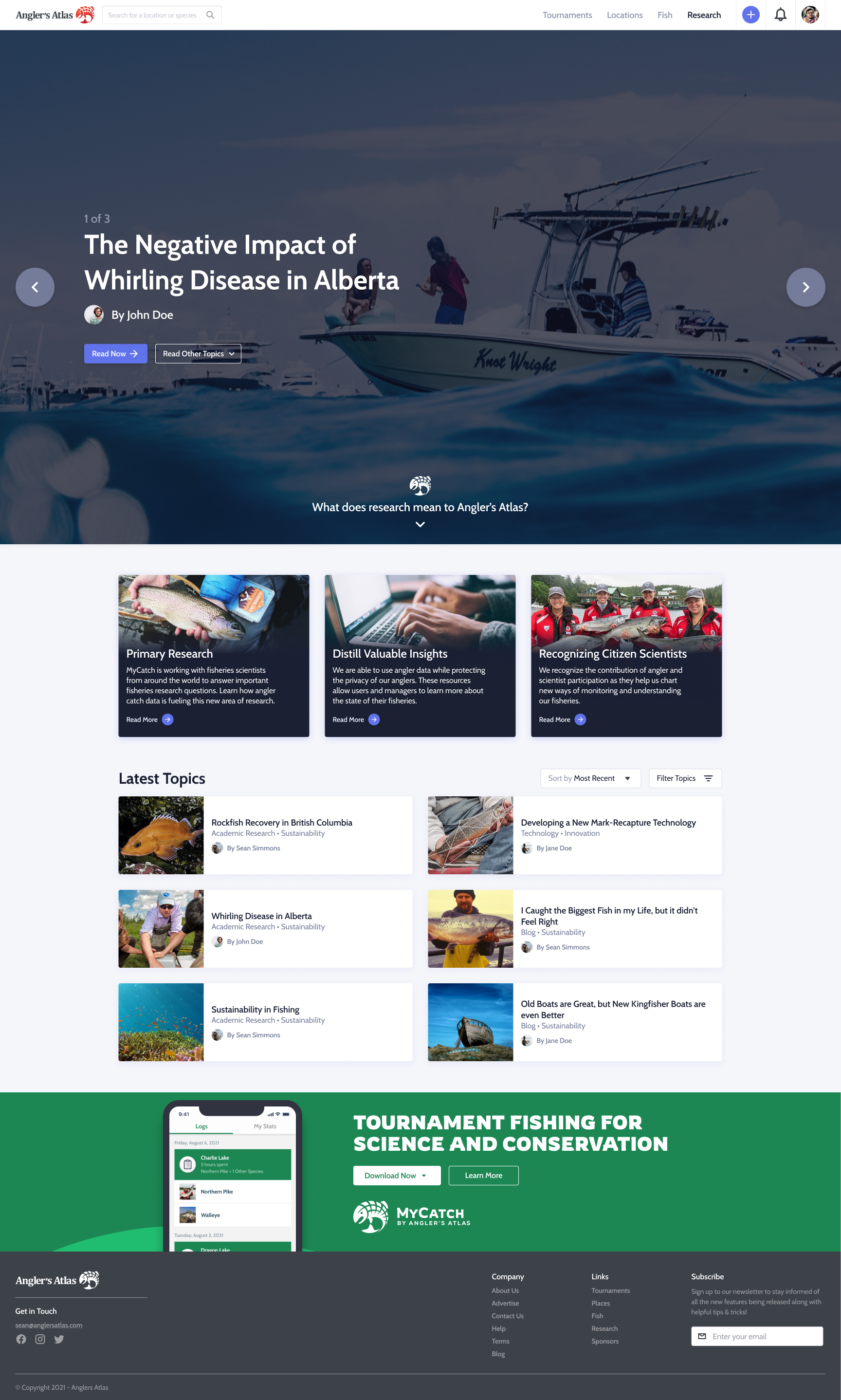
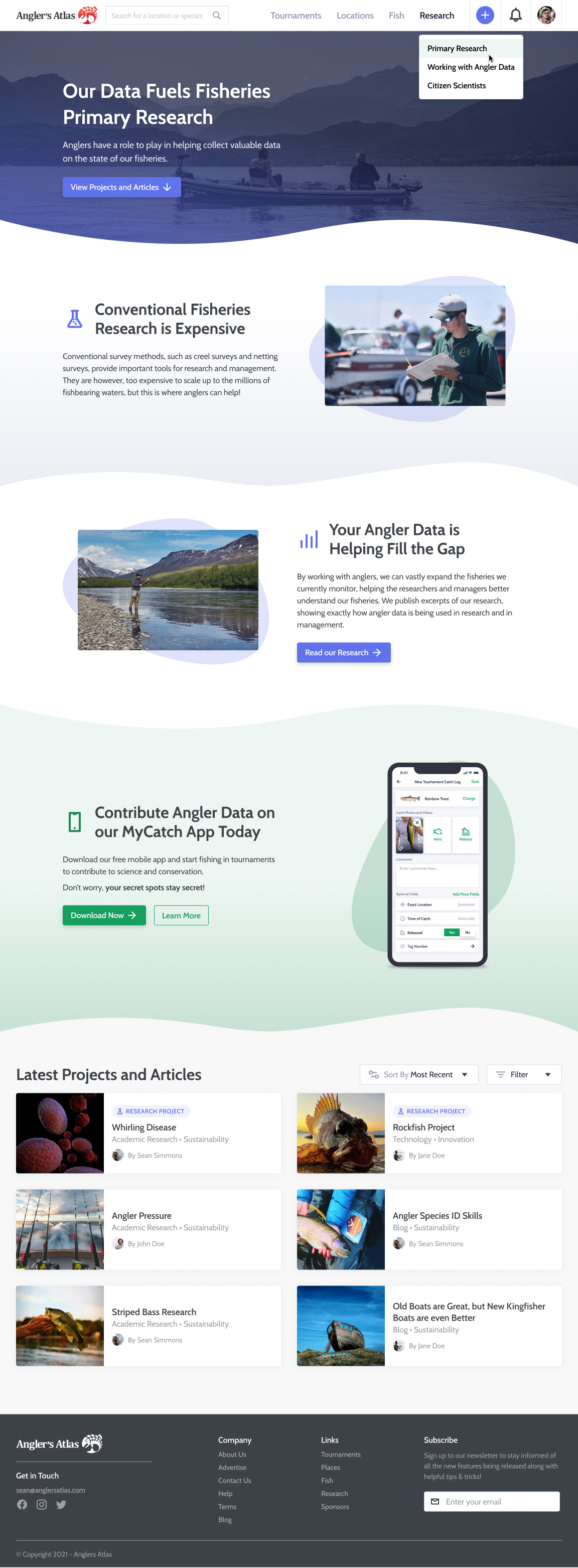
Citizen Scientists/users were deeply interested in the MyCatch angling data they were sharing, and Angler's Atlas was a platform to showcase how was data was used. I crafted intuitive landing pages that provided users with a comprehensive overview of the information at a glance. These pages effectively showcased the data's value and made it easily accessible to both the Citizen Scientists and the wider angling community.
Challenge #3: The MyCatch Rebrand
As we delved deeper into the development of MyCatch, we realized that it also faced a different challenge—an identity crisis. MyCatch was prevalent on Angler's Atlas' website, and the initial visual identity of MyCatch closely resembled that of Angler's Atlas, causing confusion among anglers when registering for an account and performing certain tasks. MyCatch was for contributing to science and fishing tournaments, and Angler's Atlas' indispensable brand was for fishing maps and research articles.
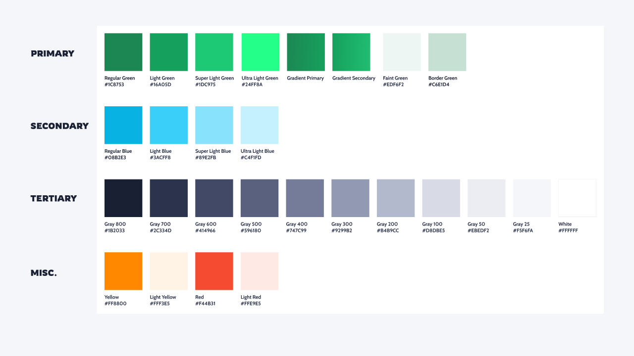
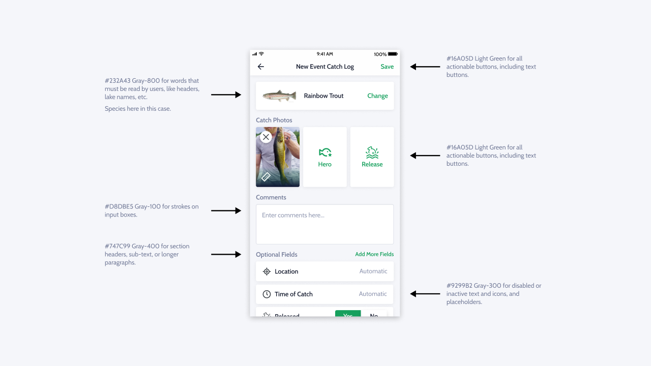
After months of consideration and deliberation, we prioritized the rebrand of MyCatch to alleviate confusion and also take the opportunity to cater more to our refined target audience. We went for a more masculine, nature-inspired colour palette, and a nautical, unique typeface for main headers. Bathymetry data is also "gold" in the angling world, so we used the pattern as a motif across various touchpoints.
Process
The design team and stakeholders, including the CEO and developers, had regular Saturday meetings to discuss design progress and output. During these meetings, the team reviewed flows, exchanged ideas, and provided valuable input to help prioritize design tasks. For the branding exercise, I presented a detailed UX audit of the website and highlighted the pain points of a user's journey around the website and app, ultimately compelling the CEO to recognize the necessity for a small rebranding effort.
This collaborative approach fostered effective communication, ensured alignment between design and development, and facilitated the successful execution of MyCatch's various features.
Outcome
MyCatch is on both iOS and Android, with an average rating of ⭐4.6 stars on the App Store, and ⭐4.6 stars on the Google Play Store as of December 2023.
Anglers continue to use MyCatch to log their tournament catches, with multiple tournaments going on at any given time in both Canada and the United States. Angler's Atlas continues to trailblaze with its Citizen Scientist initiatives, and various research events via MyCatch today.
Want to chat about this project?
